La Hormiga Clean
An Identity That Reflects Hard Work and Community
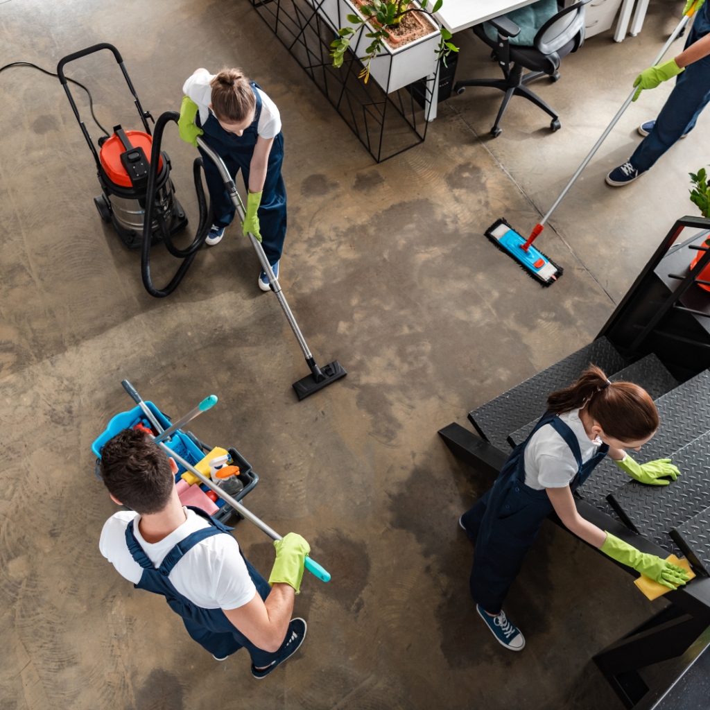
La Hormiga Clean is a newly established cleaning company in New York that serves commercial buildings and specialized facilities, including medical centers. For this cleaning company branding project, our focus was to create a brand identity that reflects professionalism, cleanliness, and the founder’s unique values.
Services
The Goal
Broadening Horizons
Our goal for this cleaning company branding project was to create a versatile logo that reflects the founder’s unique connection to the name "La Hormiga." By incorporating the symbol of an ant, we aimed to capture themes of hard work and community while maintaining a clean, professional look. This resulted in a design that works effectively as both a standalone logo and an adaptable isotype for various applications.

The Challenge
Breaking Boundaries
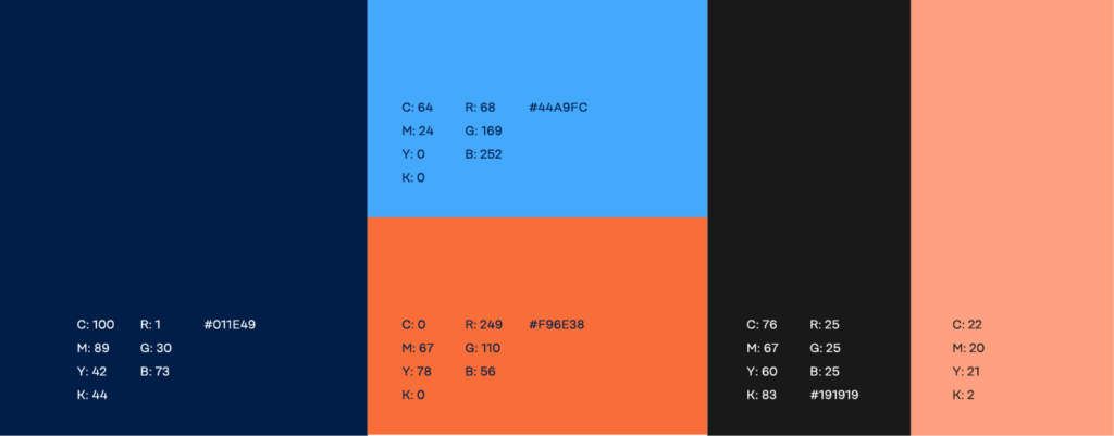
The challenge in this cleaning company branding project was aligning the ant symbolism with the brand’s focus on cleanliness. While ants represent values like dedication and teamwork, they’re also associated with insects—a potential conflict with the company’s clean image. Additionally, we needed to incorporate an orange color that held personal significance for the founder, ensuring it conveyed a polished, professional tone.
Our Solution
The Journey to Create the Wave
A Clean Ant Symbol
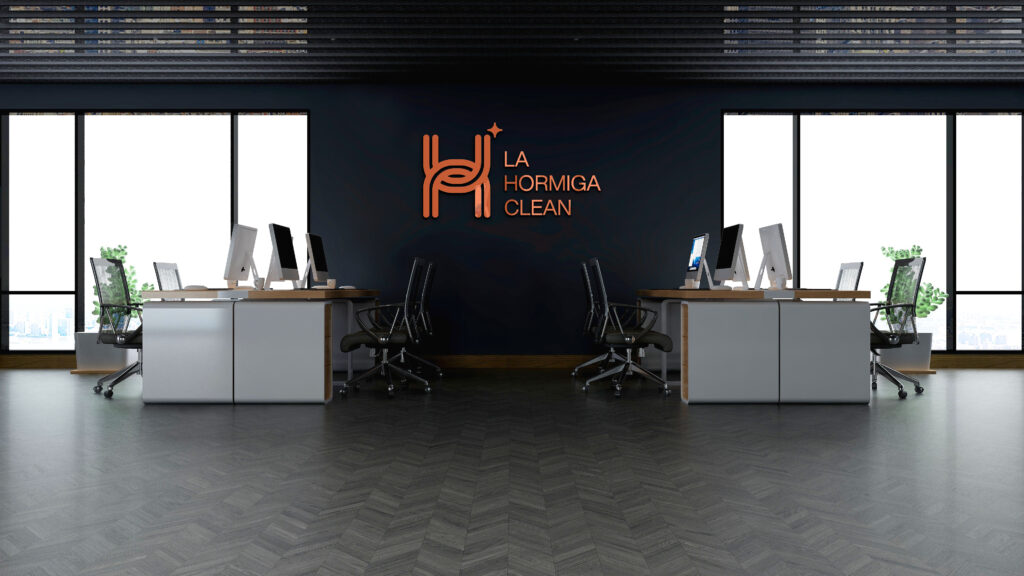
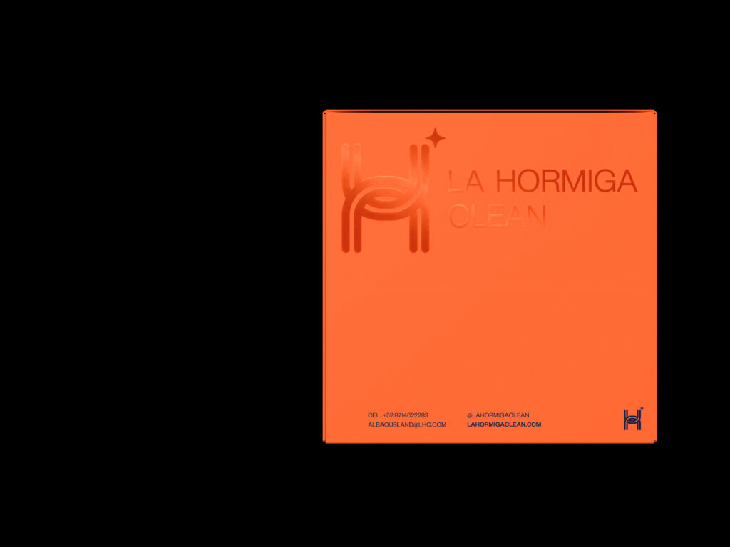
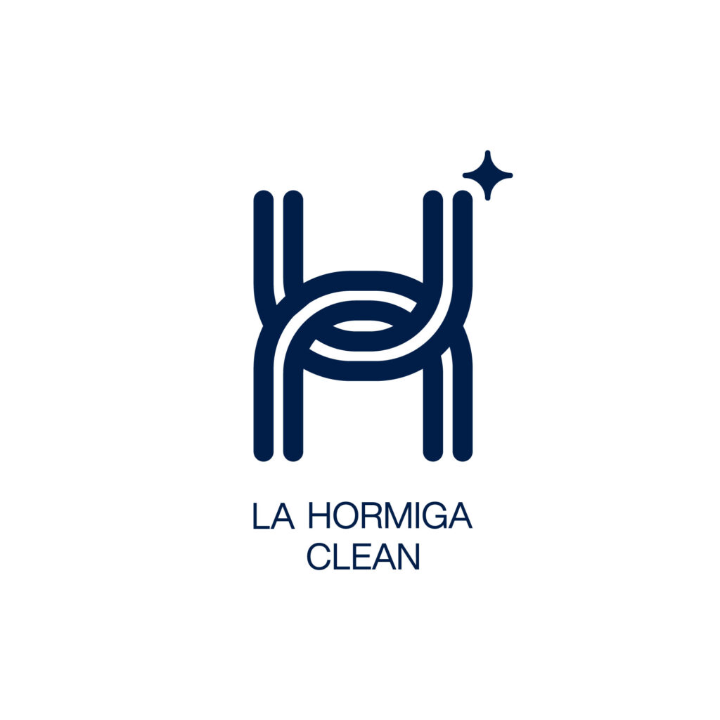
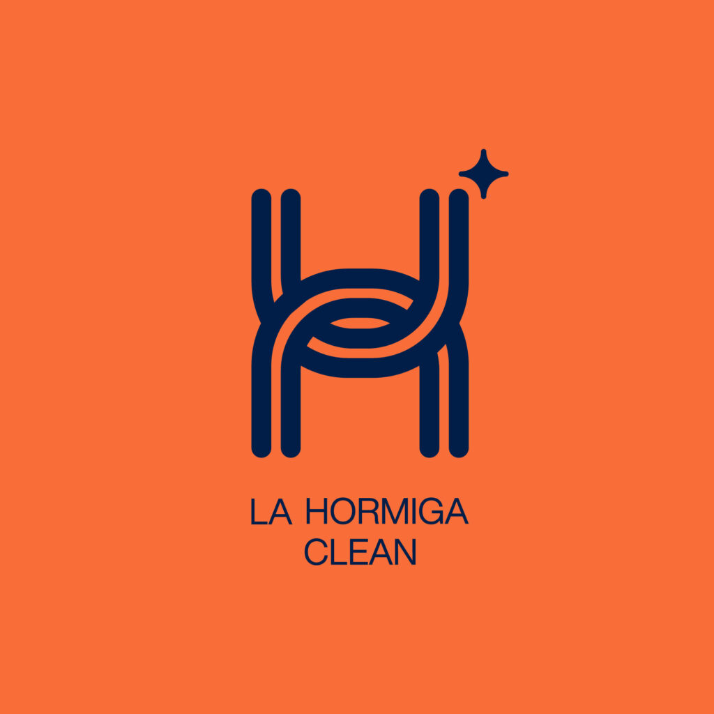
Our solution was a logo centered on an abstract “H” that incorporates ant-like features without depicting an insect directly. We used the vertical lines in the “H” to symbolize antennae, while the curved connections within the letter represent the community-oriented values of La Hormiga Clean. To highlight the company’s cleaning focus, we added a subtle sparkle detail at the top of the “H.”

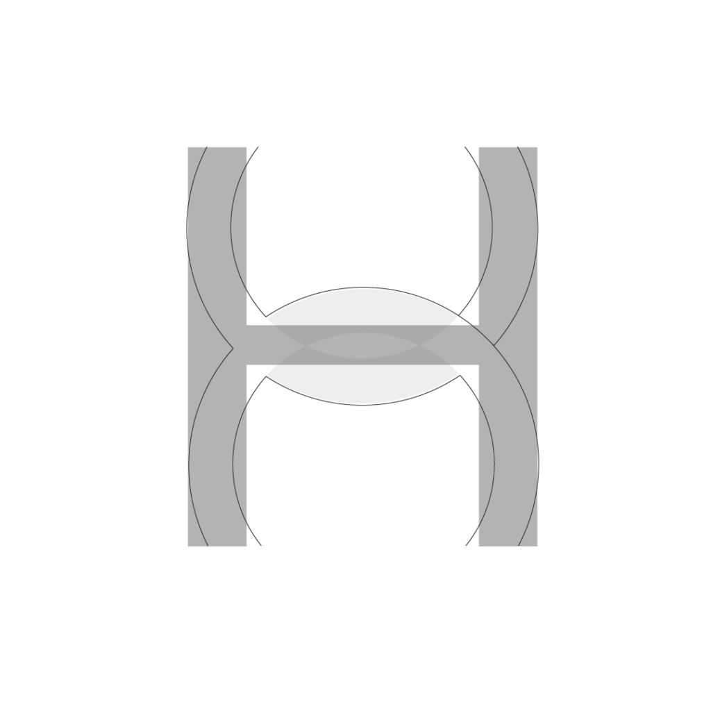
The H As an Isotype
TTo reinforce the cleaning company branding, we added a subtle sparkle detail at the top of the “H” to emphasize the company’s cleaning focus. This created a versatile logo that can function as a standalone isotype or be paired with the company name for full branding. Additionally, we designed a secondary horizontal version with the company name beside the logo for added flexibility.
A Flexible Logo
This logo design offers flexibility: the “H” functions as a standalone isotype or can be paired with the company name for full branding. We also created a secondary horizontal version with the cleaning company name beside the logo.
The Results
A Unique Logo Design that Embodies Hard Work and Unity
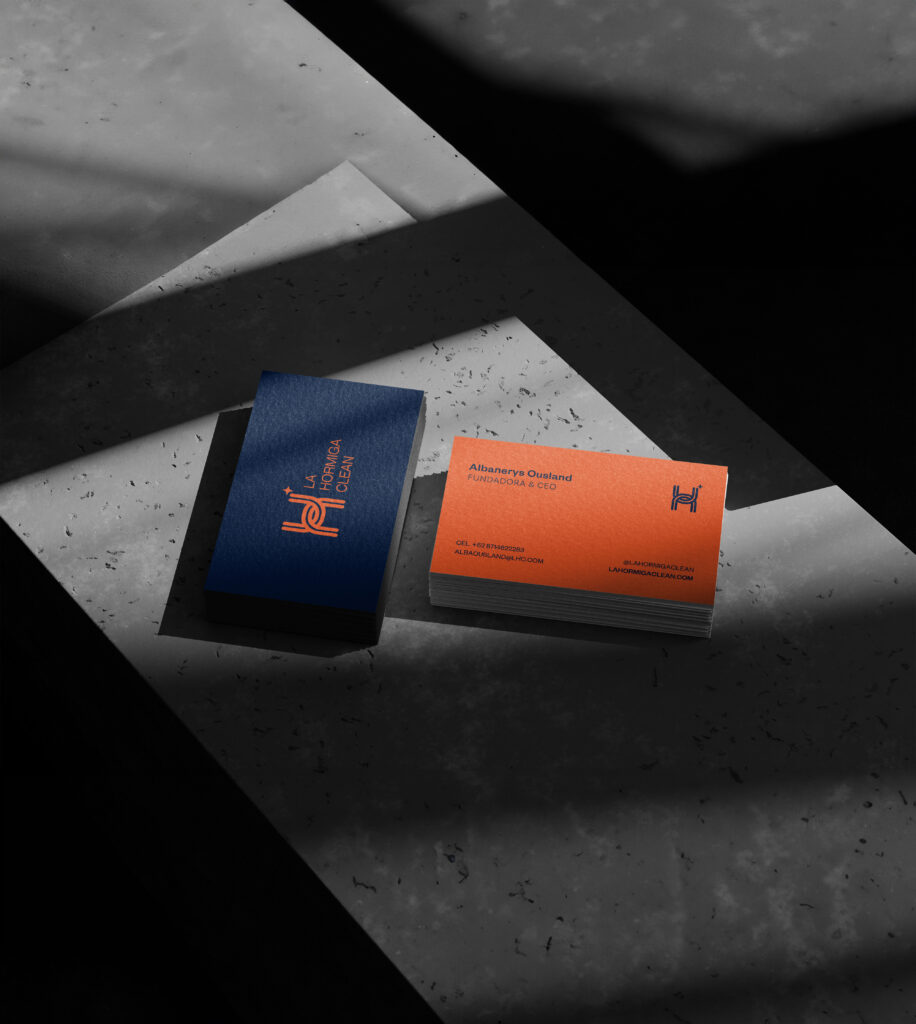
Delivered in both monochrome and the requested orange hue, the logo adapts seamlessly across digital and print materials. Additionally, our final brand book includes applications, equipping La Hormiga Clean for effective, consistent branding as they grow.
What Our Client Says
They [Fluentica] provided great designs based on my vision and the goal of the company. They were able to deliver exactly what I need it with the logo "theme."


